Fieldable
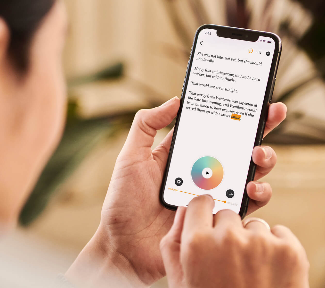
An agricultural management app that lets you edit fields and plan fertilizer inputs based on real-time updates and location-based functionality.
8 MIN READ
My Role
I was the sole UX/UI Designer in a cross-functional team of seven comprising Devs, QA Lead, Technical Writer, and Project Manager.
We divided the app features into different development sprints to deliver this MVP product. We could refine and polish the design using the Agile development process.
DESIGN PHASE
- Define project scope with the client
- Conduct UX research
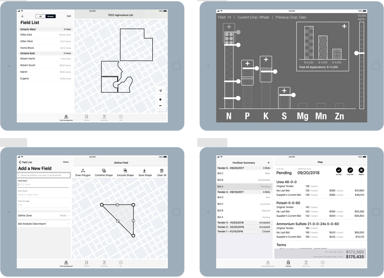
- Create wireframes for the GPS map, nutrient calculator, and fertilizer budget summary
- Define visual style and create Hi-Fi mockups & prototypes
DEVELOPMENT PHASE
- Create design specification
- Deliver assets and upload asset requirement specification
- Work with QA Lead to test the app and report bugs
ROLE
UX/UI Designer
CLIENT
TECC Agriculture
TIMELINE
6-months project
COLLABORATION
Timo Puolitaipale, Bill Mak
Design Context
Agricultural professionals lack a management tool to improve soil productivity and the nutritional value of crops.
Most agronomists and farmers relied on complex spreadsheets to plan fertilizer blends and decide their crop seeding date. Analyzing results from different spreadsheets was often cumbersome during the two key production timings to focus on each year: Pre-Crop and In-crop.

Design Challenge
How to design a simple field planning tool that applies effective nutrient strategies?
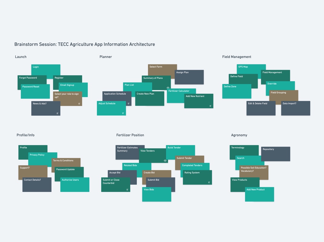
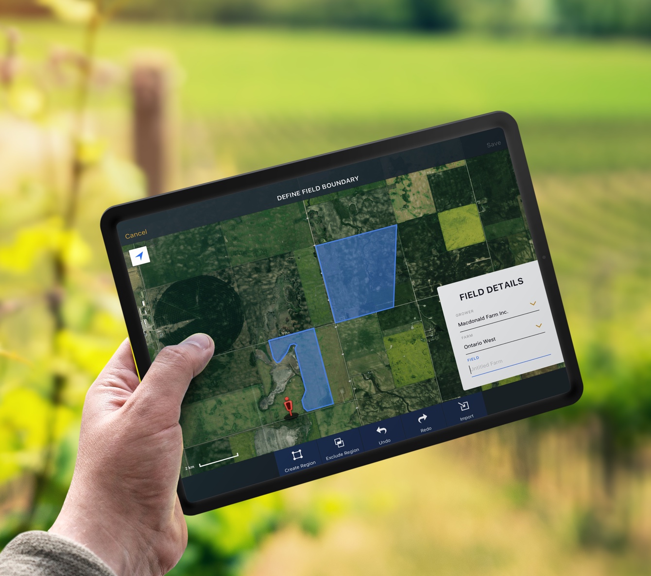
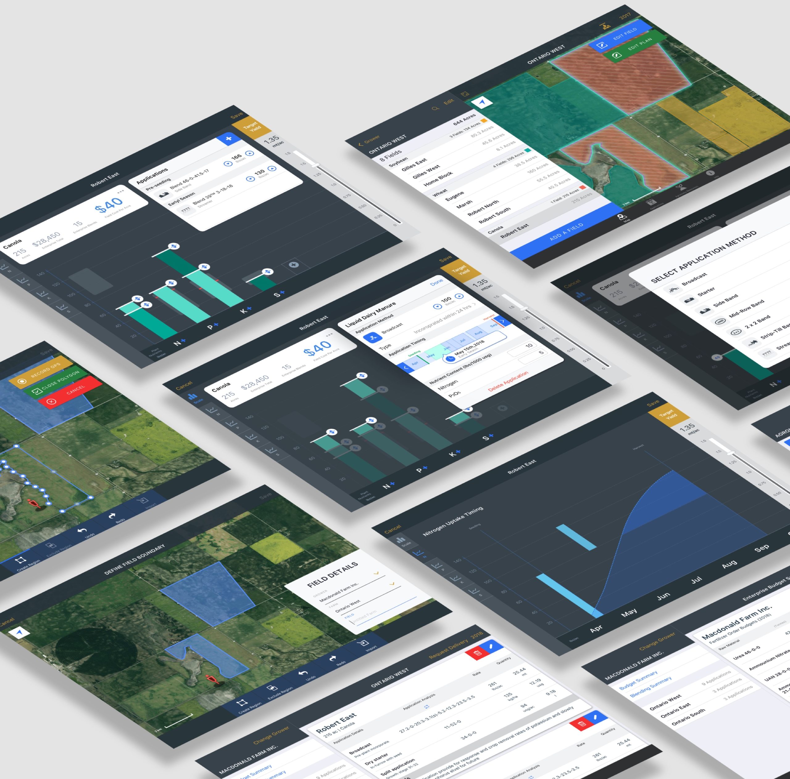
The challenges were organizing contents, defining a smooth workflow, and providing solutions to display elaborate information such as GPS mapping and adjustable fertilizer charts on small mobile devices.
UX Process
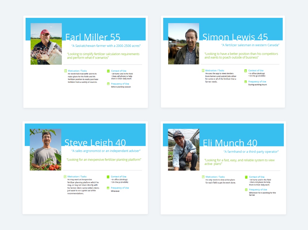
As part of our discovery workshop, we asked the client to share their vision and goals of the project. As an accomplished agronomist himself, the client was interested in creating a platform that would make field management easier for his colleagues. After interviewing potential users and sourcing the app store, I did a competitor analysis to make field planning accessible for agricultural workers.
1.
UNDERSTANDING
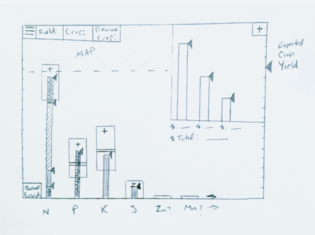
During our Discovery workshop with the client, the client briefed us on how he had envisioned a crop nutrient calculator should work. We then drew several sketches together to solidify the idea.
4.
NAVIGATION MAP
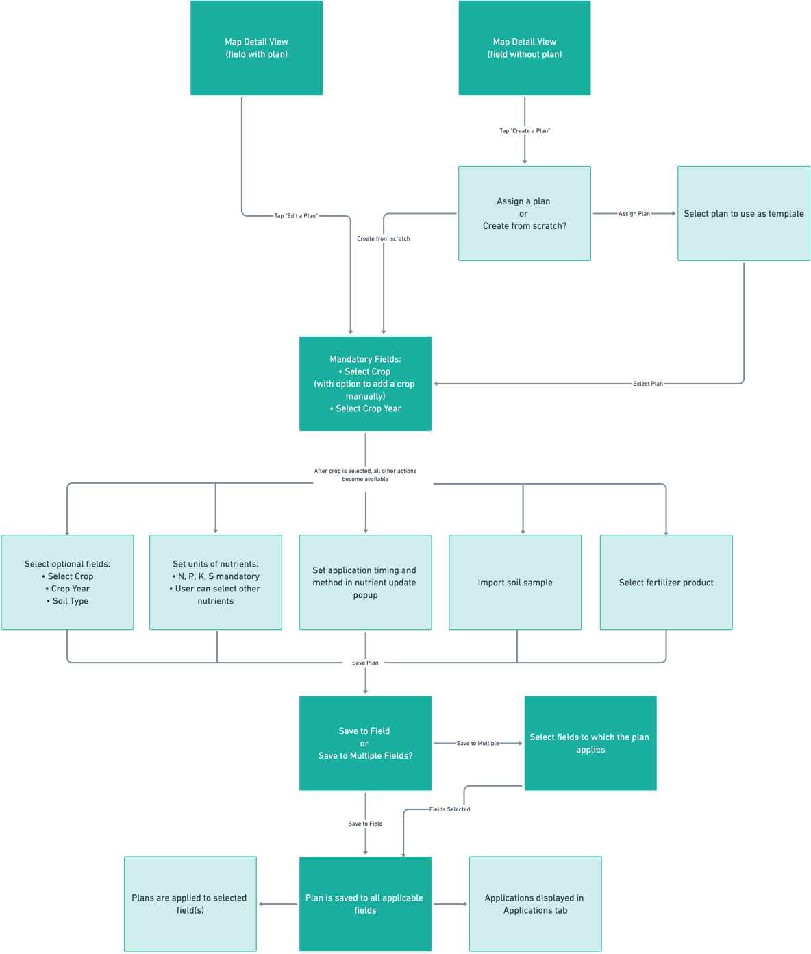
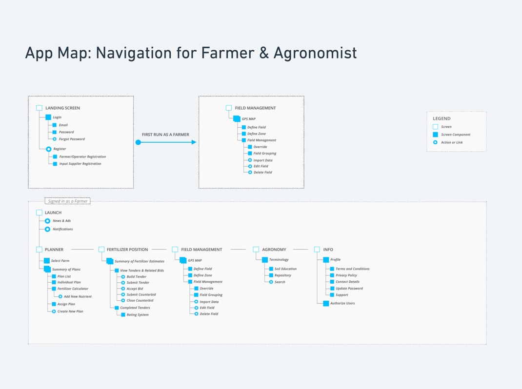
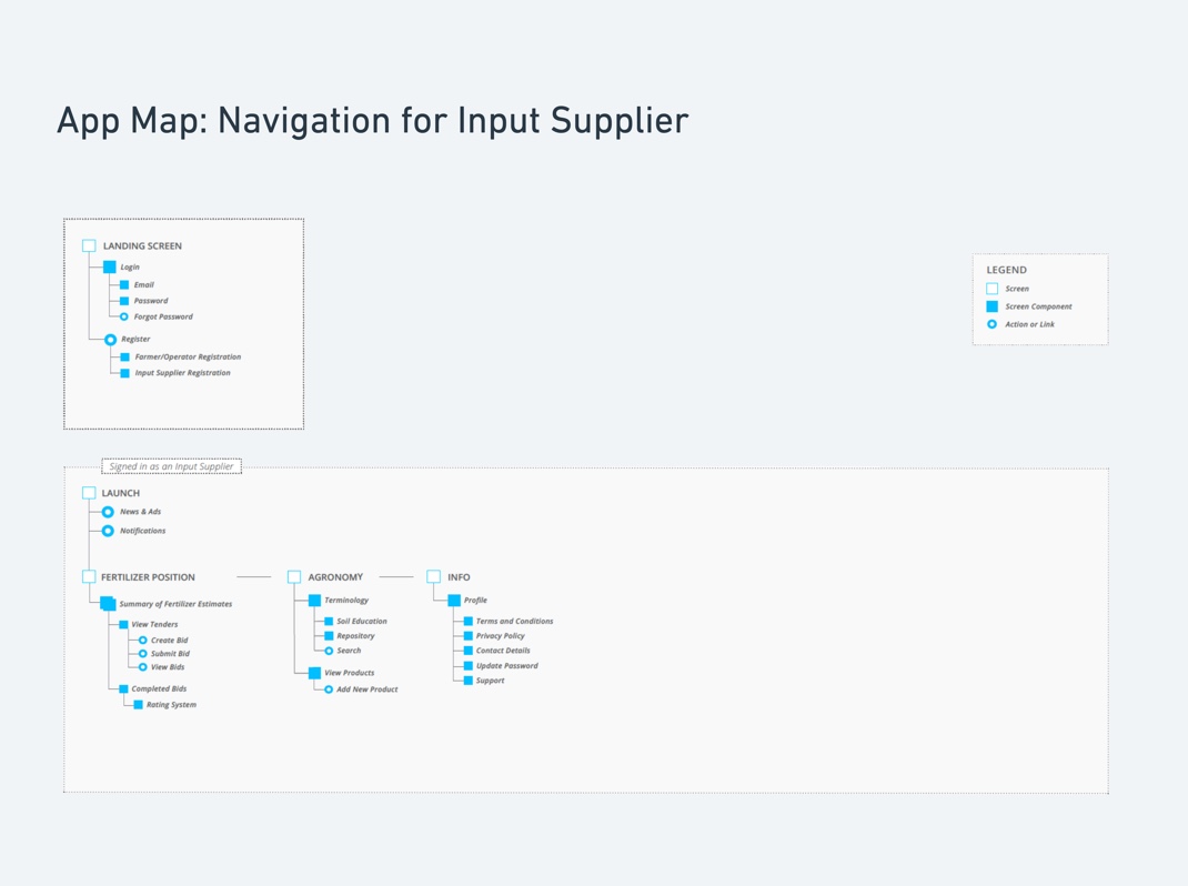
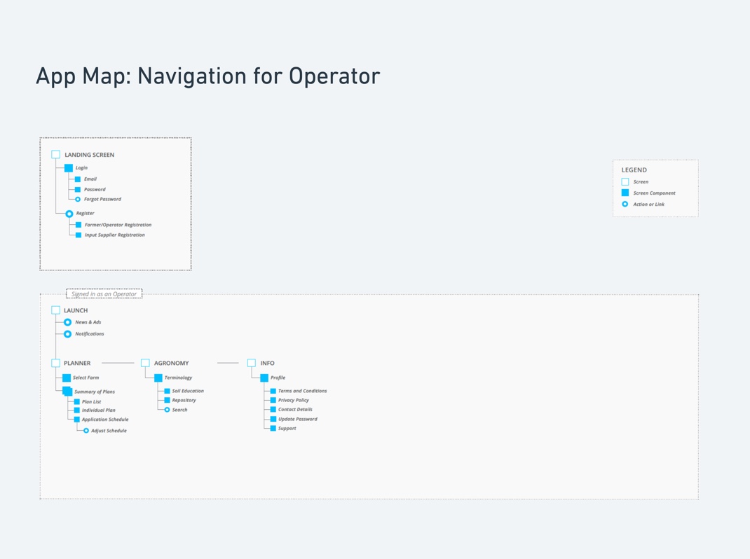
After our interviews, there were three different user flows to map out since different people had different goals to carry out in the app. Another interesting takeaway was many of our users prefer using a tablet to a phone due to the comfort of planning in bigger screen sizes. This confirmed our decision to design full features in iPad format and limit certain features for the iPhone.
5.
COMPETITOR ANALYSIS
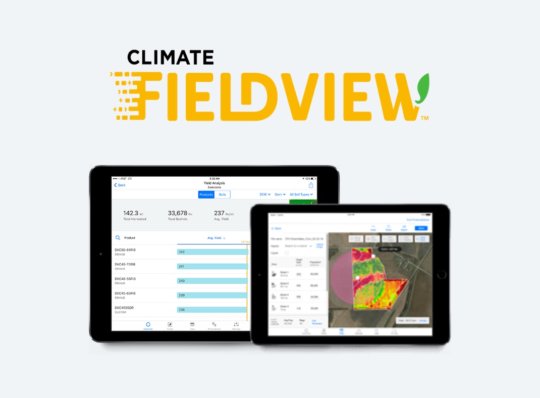
Climate Fieldview was our primary competitor. It had a similar notion of gathering all your data in one place and using data to make operating decisions. To be clear on where to position our app in the market's demands and expectations, I reviewed the competitor's existing features to understand their strengths and weaknesses.
Wireframe
I also worked on the Field Management wireframe to make sure editing and deleting the field would be seamless. We then presented three navigation flows and a set of wireframes to the client for review. Upon approval of the first wireframes and feature ideation, I moved to work on more detailed Hi-Fi mockups and prototypes.
Visual Design
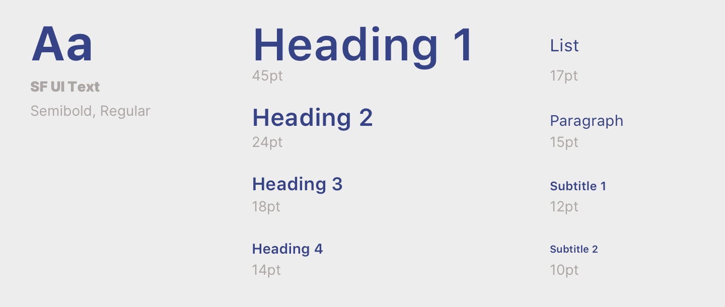
I kept the UI to be a dark theme design for the planner view. The dark theme reduced luminance and minimized eye strain for our target group, which was age 40 to 55. I avoided using pure dark background because notable contrast would be painful to look at. Instead, I used slate grey for the background. I kept most of the text big for easy readability and followed the standard system design for most parts to reduce the learning curve in our age group. Overall, the visual intended to be simple to perform each task.
TYPOGRAPHY
UI COLOUR STYLE


ICONOGRAPHY
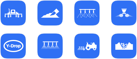
APPLICATION METHOD
Outcome
RECEIVED USER APPRECIATION
The app was well-received on the iOS app store after its first release in 2019. One of the users tweeted that the app was “well thought out and surely save your time”. The final product simplified the whole fertilizer input process for targeted users to make more informed decisions all year long.
GAINED INDUSTRY RECOGNITION
The app featured on Farms.com on Jan 24, 2019. The site recommended the app as a tool that “helps you make fertilizer application plans for your farm and easily share them with your team”.
INNOVATIVE FERTILIZER PLANNING & TEAM COMMUNICATION
The app provided easy fertilizer planning for growers of all sizes. It fulfilled the project goal and offered a simple way to communicate last-minute changes at seeding time between farmers, suppliers, and operators.
“How to Build a Fertilizer Plan with Fieldable App.” Youtube, video source from Fieldable Team.
Lessons Learned
Sorting Complex Information
Presenting complex nutrient inputs was challenging throughout the entire design process. Instead of showing everything on one screen, I learned it’s better to segment the information into smaller, digestible chunks and display it in a sequence. After communicating with the client and testing our prototypes with different users, I designed a simplified structure for users to input their nutrients data.
Overcoming Fear of the Unknown
I had zero knowledge of the agricultural field when I started the project. The details of the nutrient calculator overwhelmed me at the beginning, and I did not know how to design it, to be honest. I felt stuck for a while and made mistakes of pretending I understood it. Soon I realized what I needed to go forward was to stay open to the unknown subject. What made me feel stuck was not the subject itself, but my fear of not getting it. Embrace the feeling of being uncomfortable, then you would start learning something new.
Selected Works
