Party Planner App
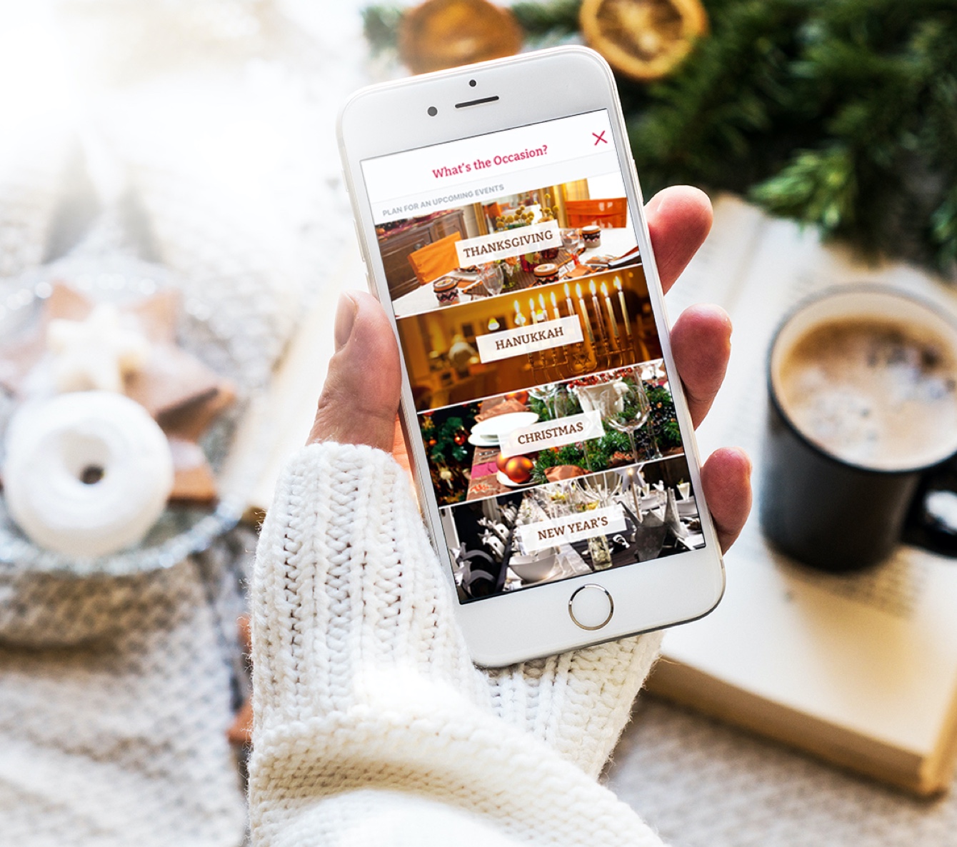
The Kellogg's Party Planner app simplifies party planning and introduces you to various ways to plan parties using Kellogg's products.
6 MIN READ
My Role
I was as one of two UX/UI Designers on an eight-person cross-functional team comprising developers, testers, and a project manager. The project was completed in partnership with Catapult Marketing.
Considering the project scope was thoroughly discussed in advance and contract terms restricted changes, we divided this project into phases and used waterfall project management.
DESIGN PHASE
- Assist in planning and conducting user research
- Develop navigation map and workflows
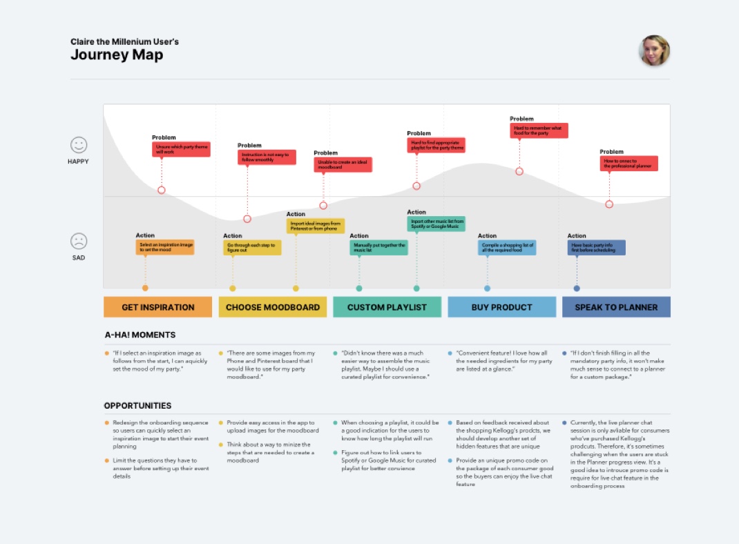
- Create user stories and user journey maps
- Wireframe for party theme choice, mood board, recipe shopping list, invite friends, and party planner live support
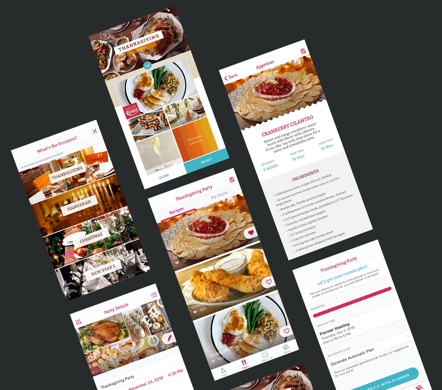
- Define visual style and create Hi-Fi mockups & prototypes
DEVELOPMENT PHASE
- Create design specification
- Deliver assets and upload asset requirement specification
- Work with QA Lead to test the app and report bugs
ROLE
UX/UI Designer
CLIENT
Kellogg's (Keebler Brand)
TIMELINE
6-months project
COLLABORATION
JL Lum, Catapult Marketing
Design Context
Successful parties make positive memories, but event planning can become overwhelming.
To connect with its consumers as the holiday season approached in 2016, Kellogg's consulted with us to develop a party planner app. With every purchase of Kellogg's products, customers could access in-app chat sessions with party planners.
Design Challenge
In what ways do you plan the perfect party that reflects your vision as a host?
In order to connect the user to our Live Planner, we first organized every aspect of party planning. We sought to both attain business goals and satisfy users as part of the planning process for a successful party.
UX Process
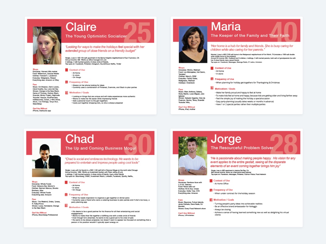
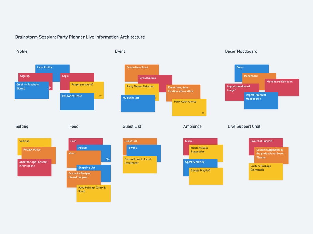
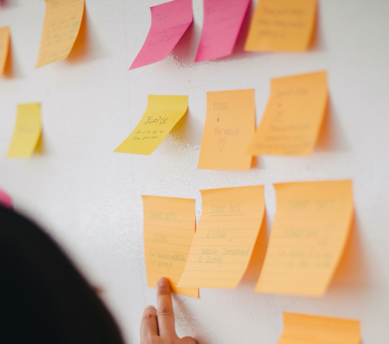
Our team organized an initial discovery workshop with the client to understand business requirements and create a consensus on priorities for this project. After understanding the project direction and goal, we generated ideas and organize features using affinity diagrams in UX meetings. To understand how events are planned and the demographics of the target audience, we searched online, analyzed similar apps, and talked to potential users.
1.
KEY RESEARCH TAKEAWAYS
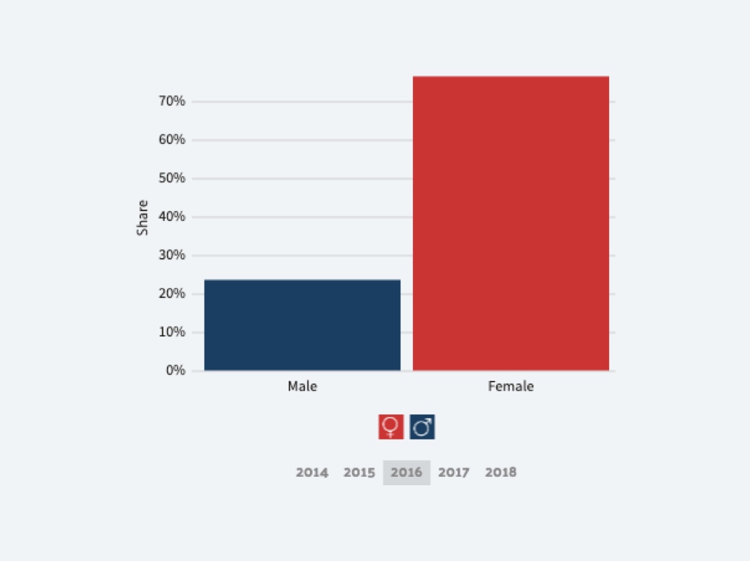
The 2016 Data USA study showed that 88.2% of event planners were women, with an average age of 36, making them the dominant gender in this field. In our search for popular apps that could be used for party planning, we discovered Pinterest is often used for mood boards, Evite for invitations, and Spotify for music.
*Graph by Data USA website
4.
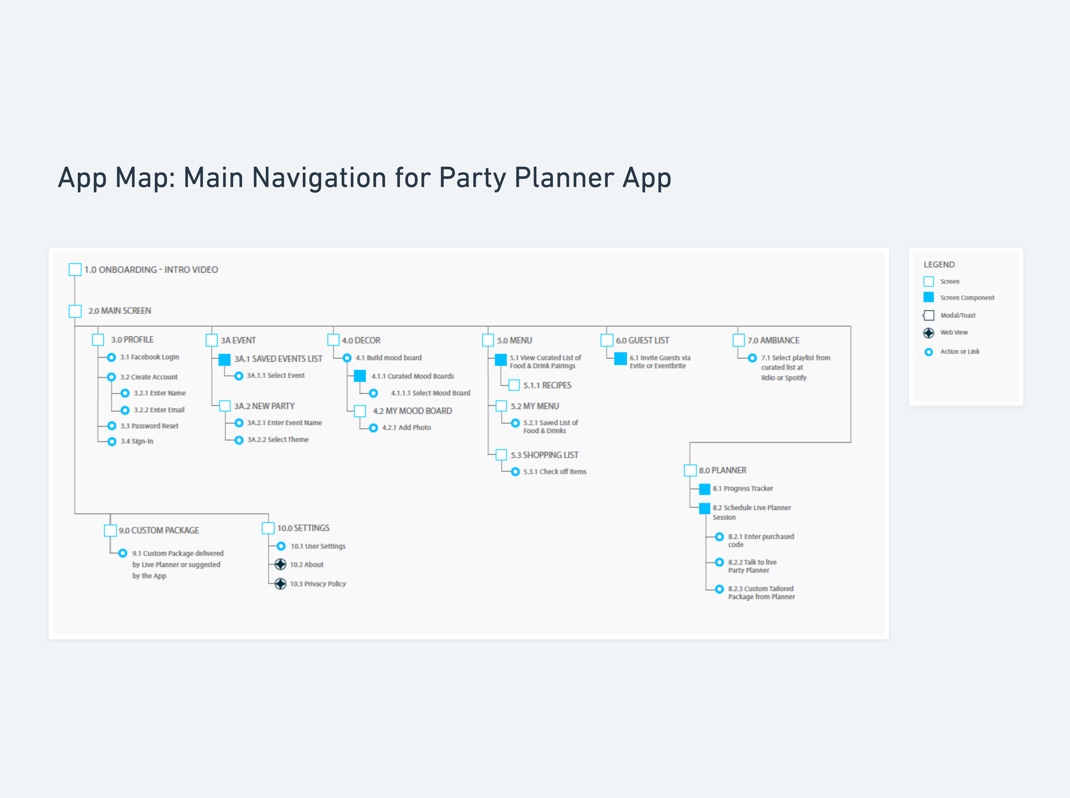
NAVIGATION MAP
Our interview findings confirmed our hypotheses of potential features: user profile, event details, decor mood board, food planner, guest list, E-vites, music playlist creator, and live-planner chat support. After we listed out key features, we mapped out how users will navigate through the app.
Wireframe
In the process of our UX research, we developed an app map and provided a prototype of wireframes to the client for their review. After reviewing and accepting the features, I created HiFi mockups based on the wireframes.
Visual Design
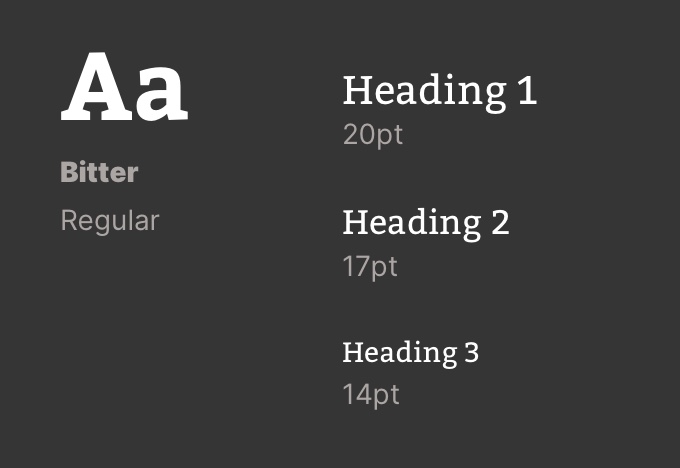
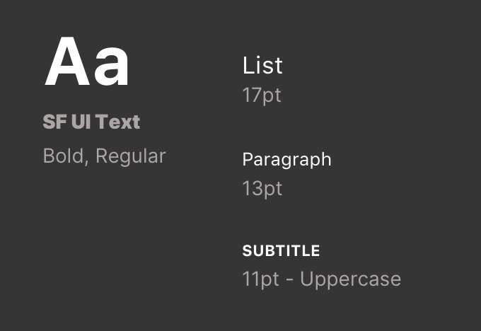
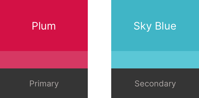
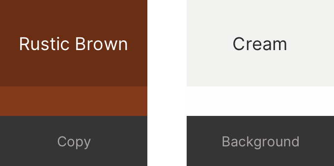
Our users would present and arrange their party visions so the app should feel personal. To convey a friendly and inviting image to our users, I incorporated scrapbooking elements such as zigzag patterns and decorative labels. I chose Bitter as the main font for the ease of reading on screen. Its contemporary slab-serif characteristic also added a touch of boldness and confidence. Vivid images were crucial in the app to portray various party themes. Catapult supplied marketing photos for me to test in our Hi-Fi mockups.
TYPOGRAPHY
ICONOGRAPHY
VISUAL ELEMENTS

VISUAL ELEMENTS
Outcome
RECEIVED W³ AWARD, MOBILE SITES & APPS CATEGORY
The app was well-received on both the iOS app store and Google Play after its first release. It had won the 2017 W³ Award for Best Visual Design in Mobile Sites & Apps category.
SAVED COSTS FOR OUR CLIENT
Our partnerships helped Kellogg's reduce their costs by connecting them with industry leaders who provided third-party integrations for their app.
MET BOTH BUSINESS GOAL AND PROJECT GOAL
We addressed the essential steps involved in party planning for our target market. As a result, Kellogg's consumers could become more engaged with their products, thereby achieving its business goals.
*Promotional video from Catapult Marketing
Lessons Learned
Managing Conflict in the Design Process
The client brought us on board later, so there was a competitive tension between our team and the existing marketing firm. After exchanging our values on the project and finding common ground with the external partner, we learned that ego was unnecessary during the design process. We designed solutions for end-users, not to impress clients or outshine our fellow teammates. Teamwork and selfless contributions enhanced the success of a project.
Applying Lean UX Design Approach
We ensured we didn't compromise the design phase by combining Lean UX with the waterfall model. To help us make quick decisions, we posed a series of questions, such as, "What steps do users need to take before they can access Lives Planner?" and "How do brands connect with users that they trust?". We focused on obtaining comments as early as possible from our stakeholders and potential users to confirm our hypotheses. I learned how to apply iterative methods to the user experience through three simple steps: thinking, making, and checking. By sharing our findings and rapid prototyping within the teams early and often, we avoided a delay in development.
Selected Works
